
Design Systems Aren’t Just for Big Companies.
For a long time, design systems have been associated with massive teams, think Google’s Material Design, IBM’s Carbon, or Microsoft’s Fluent. They’re seen as large-scale investments with dedicated designers, internal documentation portals, token libraries, and governance models.
But at Pragmatk, we’ve found that even early-stage or mid-size product teams benefit from having some form of a design system in place, especially when speed, consistency, and cross-functional handoff matter.
Recently, we worked with a fintech startup rebuilding their core web platform. Their product team was lean. Their design team was one person. Their backlog was growing faster than their frontend could keep up. And yet, the cost of not having shared UI patterns was showing up every sprint in code reviews, in QA bugs, and in time spent rebuilding the same components with slightly different specs.
They didn’t need a Figma playground with 200 tokens. They needed alignment.
The Problem
Without a shared system, even small teams lose efficiency quickly.
We noticed a few things happening repeatedly:
The same modal was built three different ways across different features.
Colors and typography didn’t follow any logic; what “looked right” in the moment got pushed.
Developers were waiting on mockups, then guessing when things weren’t spec’d.
QA flagged UI inconsistencies that weren’t technically “broken,” just inconsistent.
More importantly, designers felt like they were re-solving the same layout decisions over and over. And engineers didn’t know what could be reused versus what needed to be created from scratch.
The team wasn’t inefficient because they were small; they were inefficient because every interface decision was made in isolation.
The Task
We proposed something simple:
Let’s create a lightweight design system that is defined just enough to reduce rework and improve predictability.
No documentation site. No full rebrand. No new tooling.
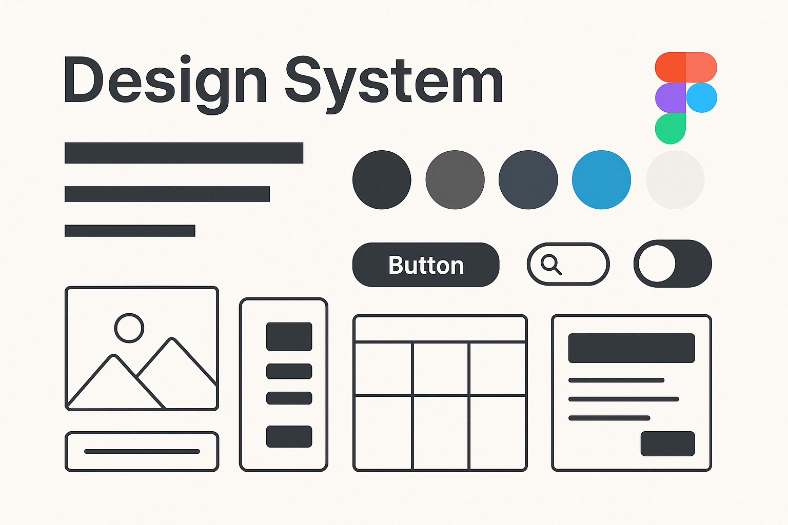
Just a shared source of truth for layout, components, colors, and states across both design (Figma) and code (React).
The Actions We Took
1. Inventory first, not ideation
We didn’t start by building something new; we started by documenting what already existed.
In Figma, we audited current screens and identified repeated patterns: buttons, form fields, modals, nav bars, tables, and alerts. Some were consistent. Most weren’t.
We met with the frontend lead to review the existing components in the code. To our surprise, nearly 40% of what we needed was already built, but duplicated or undocumented.
2. Defined a shared visual language
Instead of a full brand refresh, we focused on creating a simplified visual language:
Primary and secondary colors
Default spacing units
Font stack and weights
Grid and layout behavior
Component states (hover, disabled, active, error)
It took two working sessions. We weren’t chasing perfection; we were chasing alignment.
3. Built a functional component library
We worked with the engineering team to wrap common React components into a shared @ui folder within the monorepo, which included:
Buttons
Input fields
Alerts
Card components
Modal wrapper
Each was built with TypeScript, styled-components, and light documentation in Storybook.
The emphasis was on usability, not reusability. We didn’t make components “universal,” we made them consistent. That mattered more.
4. Tied design to code
Once the library stabilized, we synced it back to Figma using simple naming conventions. The designer could now prototype with the same structure that engineers used to build.
When a new feature was spec’d, everyone knew what the building blocks were. And if something wasn’t in the system, it had to be discussed, not just invented.
The Results
The impact was subtle, but real:
Time to mock new flows dropped by ~30%
PMs started reviewing clickable prototypes with consistent behaviors
QA flagged fewer cosmetic issues
Engineers reused components more, with fewer questions
New contributors got up to speed faster
Most importantly, the design system became part of the workflow, not a side project.
There was no internal launch. No splashy slide deck. Just better alignment and smoother handoff between design and engineering.
Takeaway
Design systems don’t need to be massive to be meaningful.
If you’re part of a small product team, consider creating a lightweight design system: a shared set of decisions that reduces ambiguity, prevents UI drift, and makes your team faster.
You don’t need to publish it. You just need to use it.