
An Intern Built a Better Dashboard Than We Ever Did
At Pragmatk, we value clarity. It shows up in how we write, how we code, and how we design. Still, even with those values, it’s easy for experienced teams to overcomplicate things, especially internal tools.
Earlier this year, one of our summer interns was tasked with redesigning a simple internal dashboard that visualized project status across client engagements. The current version had grown bloated. It included integrations with three different APIs, filters that were unused, and a design system that was overly rigid.
The project wasn’t critical. It wasn’t prioritized. It was, honestly, a cleanup task.
And the intern quietly made it better than anything we had built before.
The Problem
The original dashboard had good intentions. It pulled in CI status, deployment history, Jira tickets, and team assignments into one place. In theory, it gave us a clear view of project health.
In practice, it was noisy.
People didn’t trust the data, so they stopped checking it.
No one remembered how the filters worked.
The visual layout crammed too much into a single view.
The backend logic made it hard to update or extend.
Over time, we avoided it. The tool we built for ourselves wasn’t serving us anymore.
The Task
The intern, let’s call her Maya, was new to the team and had a background in design and front-end development. We gave her a simple brief:
“Make the dashboard useful again. You don’t have to preserve anything except the data sources. Talk to people. Figure out what they need. Then build that.”
It was meant as a chance for her to get familiar with our stack. Instead, she gave us a reminder about what focused product thinking really looks like.
The Actions Maya Took
1. Talked to five people before writing a single line of code
Instead of diving into the repo, she opened Slack and booked quick 15-minute chats with engineers, PMs, and ops folks. She asked:
When do you check the dashboard, and why?
What are you hoping to see?
What would make it easier to trust?
Those conversations revealed a pattern. Everyone wanted the same three things:
A quick status summary for each project
A reliable indicator of blockers
A direct link to the last successful deployment
Everything else could go.
2. Designed around use, not features
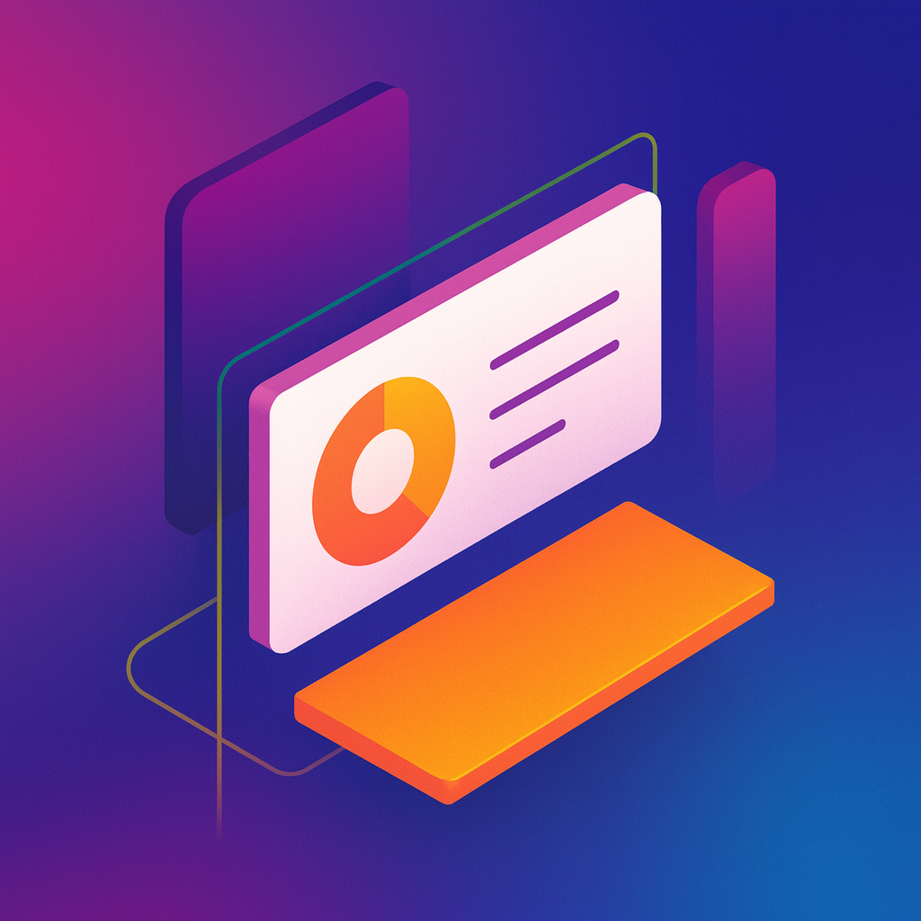
Maya didn’t try to rebuild what existed. She opened Figma and sketched out what people actually wanted: a simple grid. One row per project. Green or red status icon. Key info. A “details” link.
No filters. No charts. No dark mode.
She used color and spacing to create hierarchy. She made sure everything was accessible. It looked plain, but it was incredibly readable.
3. Rewrote the front-end in plain HTML and Tailwind
Instead of using the bloated component library we had in place, she built everything from scratch. The result was a fast, lightweight UI with no abstraction tax.
Load time dropped from six seconds to under two. Error messages were clearer. Deploy previews looked exactly like the live version.
4. Added just one opinionated rule
If a project hadn’t had a successful deploy in 10 days, it was flagged. She didn’t wait for consensus. She made the call.
Turns out, that one feature sparked more conversations than the entire previous dashboard ever had.
The Results
The new dashboard became part of our daily standups again
Engineers referenced it more than the old Jira board
PMs stopped asking for status updates over Slack
The intern’s PR had the fewest requested changes of any internal tool we’ve shipped this year
It worked because it was opinionated. It wasn’t trying to be everything. It was just trying to be useful.
Takeaway
Sometimes the cleanest work doesn’t come from experience. It comes from proximity to the problem and the freedom to solve it simply.
Maya wasn’t trying to impress anyone. She was just trying to make something better. And she asked the right questions before touching the keyboard.
As teams grow, it’s easy to build systems that serve the process instead of the people. The antidote? A beginner’s mindset. Fewer assumptions. More listening.
Oh, and trust your interns. They might be the only ones still seeing things clearly.
It wasn’t fancy. But it was predictable. And it worked on every machine the same way.